文章詳情頁
通過CSS實現逼真水滴動效
瀏覽:101日期:2022-06-03 11:31:37
哈嘍哈嘍!CSS真的好好玩啊,哈哈,反正我是愛了,空閑寫著玩。畫畫不好的我樂了,下面就是一個用CSS3動畫完成的模仿水珠的動效,其中主要就是會使用CSS設置陰影效果以及@keyframes關鍵幀和一些選擇器的技術,快來學習吧!!!🐬
實現效果:就很nice
你也通過一下網址進行訪問水滴點擊進入
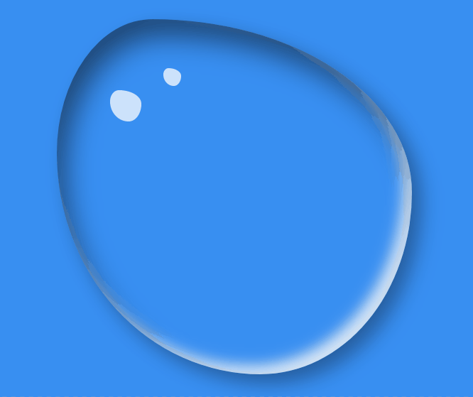
靈感:看到了這張圖陰影高亮,這屬于美術吧,哈哈,我是小菜雞
這里強烈安利GitHub上一個大牛的開源:花式邊框半徑生成器利用這個可以使這個效果實現的事半功倍,好開始coding
1.html
很簡單,只需要一個盒子就OK了
<!DOCTYPE html><html lang="en"><head> <meta charset="UTF-8"> <meta http-equiv="X-UA-Compatible" content="IE=edge"> <meta name="viewport" content="width=device-width, initial-scale=1.0"> <title>水滴</title></head><body> <div></div></body></html>
2.CSS
注釋已經寫在代碼中,這里主要學習一下偽元素選擇器的使用,box-shadow這個設置陰影的屬性,關鍵幀 @keyframes以及關鍵幀的使用 animation,和 border-radius: 30% 70% 70% 30% / 30% 35% 65% 70%;這個屬性的使用
/*清除body的影響*/*{ margin: 0; padding: 0;}/*設置背景顏色*/body{ background-color: rgba(40, 134, 241, 0.925);}/* 初始一下水,大小,彎曲,陰影*/.shui{ width: 400px; height: 400px; position: absolute; top: 50%; left: 50%; transform: translate(-50%,-50%); /* 測試用的邊框 */ /* border: 1px solid; */ box-sizing: border-box; /* 設置彎曲 */ border-radius: 30% 70% 70% 30% / 30% 35% 65% 70%; /* 設置box-shadow :水平方向陰影 垂直方向陰影 模糊距離 陰影尺寸 陰影顏色 內/外陰影(inset/outset(默認)) 盒子陰影可以有多組值,之間用逗號隔開 水平陰影和垂直陰影必須寫,其余4個是可選的*/ box-shadow: inset 10px 20px 30px rgba(0, 0, 0, 0.5), 10px 10px 20px rgba(0, 0, 0, 0.3), 15px 15px 30px rgba(0, 0, 0, 0.05), inset -10px -10px 15px rgba(255, 255, 254, 0.83); /*使用關鍵幀 watermove 9s播放 勻速 無限循環*/ animation: watermove 9s linear infinite;}/* 偽元素選擇器:在^之后插入 */.shui::after{ content: ""; position: absolute; width: 35px; height: 35px; background: rgba(255, 255, 255, 0.82); border-radius: 50%; left: 60px; top: 80px; /*使用關鍵幀 watermove 4s播放 勻速 無限循環*/ animation: watermove 4s linear infinite;}/* 偽元素選擇器:在當前盒子最前插入一個東西 */.shui::before{ content: ""; position: absolute; width: 20px; height: 20px; background: rgba(255, 255, 255, 0.82); border-radius: 50%; left: 120px; top: 55px; /*使用關鍵幀 watermove 4s播放 勻速 無限循環*/ animation: watermove 4s linear infinite;}/* 關鍵幀 */@keyframes watermove{ 20%{border-radius: 30% 70% 53% 47% / 28% 44% 56% 72%; } 40%{border-radius: 30% 70% 39% 61% / 34% 39% 61% 66%; } 60%{border-radius: 25% 75% 45% 55% / 40% 55% 45% 60%; } 80%{border-radius: 28% 72% 31% 69% / 32% 39% 61% 68%; }}3.完整代碼
<!DOCTYPE html><html lang="en"><head> <meta charset="UTF-8"> <meta http-equiv="X-UA-Compatible" content="IE=edge"> <meta name="viewport" content="width=device-width, initial-scale=1.0"> <title>水滴</title> <style>/*清除body的影響*/*{ margin: 0; padding: 0;}/*設置背景顏色*/body{ background-color: rgba(40, 134, 241, 0.925);}/* 初始一下水,大小,彎曲,陰影*/.shui{ width: 400px; height: 400px; position: absolute; top: 50%; left: 50%; transform: translate(-50%,-50%); /* 測試用的邊框 */ /* border: 1px solid; */ box-sizing: border-box; /* 設置彎曲 */ border-radius: 30% 70% 70% 30% / 30% 35% 65% 70%; /* 設置box-shadow :水平方向陰影 垂直方向陰影 模糊距離 陰影尺寸 陰影顏色 內/外陰影(inset/outset(默認)) 盒子陰影可以有多組值,之間用逗號隔開 水平陰影和垂直陰影必須寫,其余4個是可選的*/ box-shadow: inset 10px 20px 30px rgba(0, 0, 0, 0.5), 10px 10px 20px rgba(0, 0, 0, 0.3), 15px 15px 30px rgba(0, 0, 0, 0.05), inset -10px -10px 15px rgba(255, 255, 254, 0.83); /*使用關鍵幀 watermove 9s播放 勻速 無限循環*/ animation: watermove 9s linear infinite;}/* 偽元素選擇器:在^之后插入 */.shui::after{ content: ""; position: absolute; width: 35px; height: 35px; background: rgba(255, 255, 255, 0.82); border-radius: 50%; left: 60px; top: 80px; /*使用關鍵幀 watermove 4s播放 勻速 無限循環*/ animation: watermove 4s linear infinite;}/* 偽元素選擇器:在當前盒子最前插入一個東西 */.shui::before{ content: ""; position: absolute; width: 20px; height: 20px; background: rgba(255, 255, 255, 0.82); border-radius: 50%; left: 120px; top: 55px; /*使用關鍵幀 watermove 4s播放 勻速 無限循環*/ animation: watermove 4s linear infinite;}/* 關鍵幀 */@keyframes watermove{ 20%{border-radius: 30% 70% 53% 47% / 28% 44% 56% 72%; } 40%{border-radius: 30% 70% 39% 61% / 34% 39% 61% 66%; } 60%{border-radius: 25% 75% 45% 55% / 40% 55% 45% 60%; } 80%{border-radius: 28% 72% 31% 69% / 32% 39% 61% 68%; }} </style></head><body> <div></div></body></html>OK,簡簡單單,快快樂樂,歡迎交流探討,白白了你
到此這篇關于通過CSS實現逼真水滴動效的文章就介紹到這了,更多相關CSS實現水滴效果內容請搜索以前的文章或繼續瀏覽下面的相關文章希望大家以后多多支持!
排行榜

 網公網安備
網公網安備