Vue中component標簽解決項目組件化操作
一、 ??錄婦?/b>
在vue項目組件化的過程中,遇到了一些問題,什么問題呢?就是在做一個多功能,多可用,多兼容的大組件的時候,發現在這個組件內部,實現了太多的if、for邏輯,包括大量的html元素,雖然說每段功能塊都有批注,但是體積還是比較龐大,最近有些需求,需要將頁面上的一大塊篩選功能剝離開,形成單獨的組件,統一數據渲染,統一組件管理,且這些功能無論是樣式,或者是從結構來說,差異性都很大,所以考慮了以下幾種開發方式:
1. 大容量單組件開發,渲染和傳入的數據使用各種type、ctype判斷
2. 使用插槽開發,根據type調用對應的組件
3. 使用component加載組件的方式,動態渲染調用組件
最終選擇:第三種方式,采用<component>標簽動態引入的方式開發
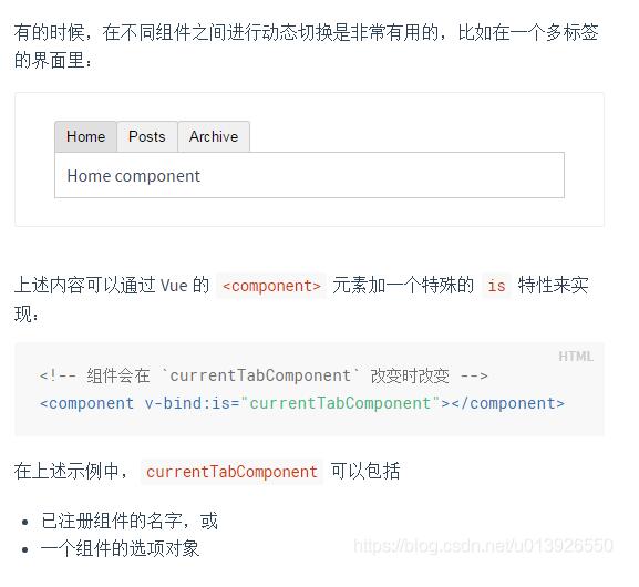
二、 官方文檔解釋
1. https://cn.vuejs.org/v2/guide/components.html#動態組件
2. https://cn.vuejs.org/v2/guide/components-dynamic-async.html
3. https://jsfiddle.net/chrisvfritz/o3nycadu/
三、 開發步驟
1. 首先按照大組件模式開發,功能拆分,統一在大組件中實現所有功能模塊的樣式 ( 注意:需要在在局部樣式覆蓋全局樣式的條件需要在樣式中使用 /deep/ 、 >>> )
<template> <div class='filter-input-container'> <!-- 選項卡 --> <div class='filter-line'> //... </div> <!-- 時間選擇 --> <div class='filter-line'> //... </div> <!-- 信息列別下拉框 --> <div class='filter-line'> //... </div> <!-- 搜索表單框 --> <div class='filter-line'> //... </div> </div></template> <script scoped> import { DatePicker, Select, Option, Button, Input } from ’element-ui’; export default { components:{ ’el-date-picker’: DatePicker, ’el-select’: Select, ’el-option’: Option, ’el-button’: Button, ’el-input’: Input } } </script> <style scoped lang='stylus'> @import ’./stylus/filter-input.styl’</style>
2. 單個功能組件剝離成單獨的組件文件
(1)搜索:fi-search.vue
(2)下拉: fi-select.vue
(3)標簽:fi-tab.vue
(4)時間:fi-time.vue
然后在每個單獨的組件內設置默認的props值,通過這個值來動態渲染組件和綁定數據,根據組件類別綁定click或者change事件
3. 選擇一個下拉功能文件源碼示例分析
<template> <div class='filter-line'> <section class='filter-line-title'>{{title}}</section> <section class='filter-line-content'><span class='flc-span-wrap'><!-- 下拉框選項卡 --><el-select v-model='contents.value' placeholder='請選擇' :class='’selectBox’'> <el-option v-for = 'v,i in contents.options' :key = 'i' :label = 'v.label' :value = 'v.value'> </el-option></el-select> </span> </section> </div></template> <script scoped> import { Select, Option } from ’element-ui’; export default { name: ’fi-select’, data(){ return {selectValue: ’’ } }, props:{ title:{type: String,default: ’信息類別’ }, contents:{type: Object,default:() => ({ options: [ { label: ’show option 1’, value: 1 }, { label: ’show option 2’, value: 2 }, { label: ’show option 3’, value: 3 }, { label: ’show option 4’, value: 4 } ], value: ’’}) } }, methods:{ }, components:{ ’el-select’: Select, ’el-option’: Option } }</script>
4. 調用下拉框示例
<component v-bind:is='FiSelect' :title='’任務類別’'></component>
四、 數據渲染和管理的邏輯
我們將通過數據渲染及綁定所有組件內容,所以數據的結構如下:
export const listFilters = [{ title: ’工作狀態’, type: ’tab’, emit: ’’, contents: [ {name:’all’,text: ’全部’}, {name:’not-issued’, text: ’未完成’}, {name: ’is-issued’,text:’已完成’}, {name: ’is-ended’,text: ’已結束’} ]},{ title: ’工作時間’, type: ’time’, emit: ’’, contents: [ { type:’tab’,name:’all’,text: ’全部’ }, { type:’tab’,name:’today’, text: ’今天’ }, { type:’tab’,name: ’week’,text:’一周內’ }, { type:’tab’,name: ’week’,text:’這個月’ }, { type:’custom’,name:’custom’,sv:’’,ev:’’ } ]},{ title: ’來源類別’, type: ’select’, emit: ’’, contents: { options: [ { label: ’類型 1’, value: 1 }, { label: ’類型 2’, value: 2 }, { label: ’類型 3’, value: 3 }, { label: ’類型 4’, value: 4 } ], value: ’’ }},{ title: ’網站名稱’, type: ’select’, emit: ’’, contents: { options: [ { label: ’騰訊網’, value: 1 }, { label: ’新浪網’, value: 2 }, { label: ’網易網’, value: 3 }, { label: ’鳳凰網’, value: 4 }, { label: ’搜狐網’, value: 5 } ], value: ’’ }},{ title: ’工作搜索’, type: ’search’, contents: { inputValue: ’’ }}];
五、組件遍歷調用渲染
<template> <div class='filter-input-container'> <!-- 最終可以動態調用所有組件 --> <component v-bind:is='’fi-’+v.type' :title='v.title' :contents='v.contents' v-for='v,i in listFilters' :key='i'></component> </div></template> <script scoped> import {listFilters} from ’./scripts/filters.data.js’; export default { data(){ return {components:[’fi-tab’,’fi-time’,’fi-select’,’fi-search’,’fi-input’],listFilters: listFilters } }, props:{ }, methods:{ }, components:{ ’fi-search’: () => import(’../components/fi-search.vue’), //搜索表單 ’fi-tab’: () => import(’../components/fi-tab.vue’), // tab切換 ’fi-time’: () => import(’../components/fi-time.vue’), // 時間選擇 ’fi-select’: () => import(’../components/fi-select.vue’) // 選擇下拉框 } } </script> <style scoped lang='stylus'> @import ’./stylus/filter-input.styl’</style>
六、 最終案例預覽效果
補充知識:vue中component組件使用——模塊化開發和全局組件
1、模塊化開發組件:
box1.vue文件如下:
<template> <div class='hello'> <h1>測試</h1> </div></template> <script>export default { }</script>
box2.vue文件如下:import引入box1.vue,components設置,然后設置成標簽使用<box1><template>
<div> <box1></box1> </div></template> <script>import box1 from ’@/components/box1’export default { components: {’box1’: box1},}</script>
2、全局組建
<div id='example'> <my-component></my-component></div>// 注冊Vue.component(’my-component’, { template: ’<div>A custom component!</div>’})// 創建根實例new Vue({ el: ’#example’})
渲染為:
<div id='example'> <div>A custom component!</div></div>
以上這篇Vue中component標簽解決項目組件化操作就是小編分享給大家的全部內容了,希望能給大家一個參考,也希望大家多多支持好吧啦網。
相關文章:

 網公網安備
網公網安備